A Google announcement is a useful checkpoint. It need not be the first signal that the search page has changed. My March–April analysis looked at the result mix over time, rather than treating each announcement as the start of the story.
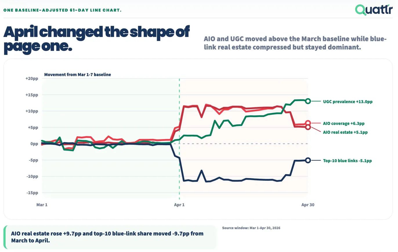
Key figures in text
| Measure | Value |
|---|---|
| UGC prevalence: April 30 versus baseline | +13.0 percentage points |
| AIO coverage: April 30 versus baseline | +6.3 percentage points |
| AIO real estate: April 30 versus baseline | +5.1 percentage points |
| Top-10 blue links: April 30 versus baseline | −5.1 percentage points |
Follow the composition through the month
In the retained chart, AI Overview coverage and real estate rise around the transition into April. User-generated content continues to gain prevalence during April. Top-10 blue links remain below their March baseline at the end, but recover part of the earlier decline.
The accompanying post described a stronger late-period recovery on desktop. This combined graphic does not isolate the device series, so that distinction needs the underlying device view before it becomes an operating conclusion.
Read each measure on its own terms
A feature appearing in more tracked results and occupying more of a measured result surface answer different questions. The chart keeps AIO coverage, AIO real estate, UGC prevalence and blue-link movement separate.
Timing alongside an update helps frame an investigation: compare changes in the sampled results with the pages and formats a brand relies on.
Use monitoring to prepare a decision
The practical thesis is to watch the search experience continuously, so a team can investigate a changing result mix before the next announcement cycle. Connect that observation to the query set, customer task and destination pages the business can improve.
- Keep the tracked basket and measurement definitions consistent.
- Review device and market views separately where available.
- Distinguish changes in ranking from changes in result formats.
- Use customer and conversion evidence to decide what to build next.
Observe the page continuously. Use announcements to test the interpretation.
Source & measurement notes
Original user-supplied Quattr graphic, matched to the archived 2 May 2026 LinkedIn analysis. The plot covers March 1–April 30 and expresses movement from March 1–7 in percentage points. Coverage and real estate are separate measures. The retained chart does not document the complete tracked-query basket, geography, device weights or measurement denominators. It is a tracked search-result sample, not observed exposure for every search user. No exact post permalink has been verified.