A sharp movement can be worth investigating without becoming a conclusion about what Google prefers. The April page-type chart raised a question about which content formats remained useful within one AI Overview measurement lens.
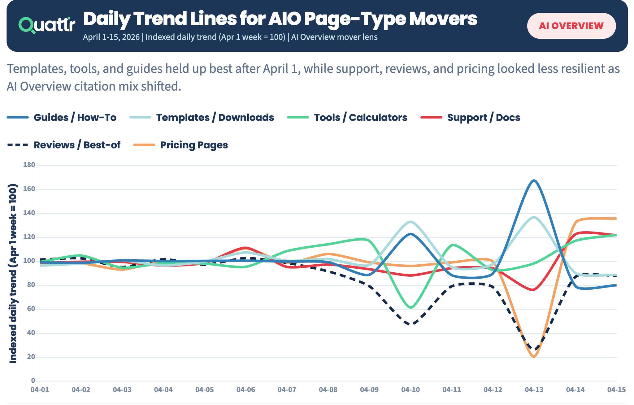
Key figures in text
| Measure | Value |
|---|---|
| Baseline shown on the chart | April 1 week = 100 |
| Reviews / Best-of: April 13 value reported in the post | 28 index points |
The units change the reading
The vertical axis is an index, not a percentage share. The archived post reported Reviews / Best-of at 28 on April 13, against a baseline of 100. That comparison describes movement relative to the April 1 baseline.
The image also shows a rebound after the trough. Reviews remain below their baseline by the end of the plotted window, while pricing and support recover differently. Calling the category permanently absent would miss that part of the graphic.
Turn the pattern into a testable question
The working hypothesis was that useful guides, tools and other task-serving experiences might behave differently from review roundups. The next step is to compare those formats across a longer observation window.
For a team, the next step is to inspect the actual pages and cited destinations within the same sampled basket. A format label can contain strong and weak examples; the customer’s task matters more than the label alone.
Look for persistence and a useful mechanism
Extend the observation window, check the underlying sample and compare the affected page types before changing a content strategy. The evidence should show whether the movement persists and what a visitor can accomplish on the destination.
- Keep index values distinct from percentage shares.
- Inspect rebounds as well as troughs.
- Compare content quality and usefulness within each category.
- Treat the format explanation as a hypothesis until broader evidence supports it.
One chart can raise a good question. Persistence and a mechanism make it actionable.
Source & measurement notes
Original user-supplied Quattr graphic, matched to the archived 17 April 2026 post. The chart is explicitly indexed, with April 1 week = 100. A reported value of 28 is 72 index points below that baseline. The underlying citation denominator, sampled basket, market and device breakdown are not retained here. No exact post permalink is verified.